White kitchens rarely fail because of the cabinetry. More often, the room feels too stark, too flat or simply unfinished because the benchtop colour was chosen in a rush. If you’re weighing up the best benchtop colours for white kitchens, the right answer usually comes down to how much warmth, contrast and texture you want the space to carry every day.
A white kitchen gives you a flexible base, but that does not mean every benchtop will work equally well. Light can wash some colours out. Strong veining can overwhelm a compact layout. Very dark surfaces can look stunning, yet they may show dust or fingerprints more readily depending on the finish. The best choice is the one that suits your cabinetry tone, splashback, flooring and the way your household actually uses the kitchen.
What makes the best benchtop colours for white kitchens?
The strongest benchtop choices do two jobs at once. They give the kitchen visual balance, and they perform well under everyday use. In family homes, that usually means looking beyond colour alone and considering finish, edge profile and material performance.
White kitchens can lean warm or cool. A crisp white shaker kitchen with brushed nickel tapware often suits softer stone shades, while a bright contemporary flat-panel kitchen can handle sharper contrast. If your floor tile has creamy undertones, a cool grey benchtop may feel disconnected. If your space gets limited natural light, a very dark top can make the room feel heavier than expected.
For many renovators, porcelain is a particularly practical option because it offers excellent stain resistance, heat resistance and easy cleaning, while zero-silica benchtops also support a healthier fabrication process. That matters when you want a surface that is not only beautiful, but also safe, durable and suitable for long-term family living.
1. Soft white with subtle veining
If you want a calm, premium look, a soft white benchtop with delicate grey or beige veining is one of the safest and most timeless options. It keeps the kitchen bright, but adds enough movement to stop the cabinetry and benchtop blending into one flat block of white.
This look works especially well in smaller kitchens, where dark contrast might feel too heavy. It also suits open-plan homes where the kitchen needs to connect gently with living and dining finishes. The trade-off is that if the cabinetry and splashback are also very similar in tone, the whole scheme can feel a little one-note unless you introduce texture through tiles, handles, timber or lighting.
2. Warm beige and ivory stone tones
Warm neutrals have become a favourite for white kitchens that need softness rather than sharp contrast. Beige, ivory and light sand benchtops pair beautifully with warmer whites, timber accents and natural-look porcelain floor tiles.
These tones are especially useful if your aim is a welcoming kitchen rather than a high-gloss display look. They help avoid the coldness that can sometimes happen with pure white and cool grey combinations. In Melbourne homes with mixed lighting throughout the day, warmer benchtops also tend to read more consistently than icy whites, which can shift blue or grey under shadow.
If you are choosing between beige and white, look closely at your splashback and wall colour. A warm benchtop can look sophisticated, but only if the surrounding finishes support it.
3. Light grey for a clean contemporary feel
Light grey remains one of the best benchtop colours for white kitchens because it creates gentle definition without dominating the room. It is a very workable middle ground for homeowners who want contrast, but not a stark black-and-white scheme.
This colour suits modern cabinetry, concrete-look tiles and matte black or brushed stainless steel fittings. It is also forgiving in busy households, as everyday crumbs and dust are often less visible than they are on very dark or very bright surfaces.
The key is choosing the right grey undertone. A blue-grey can feel crisp and architectural, but it may also feel cooler than intended. A greige or warm grey is often easier to live with, especially in homes where you want the kitchen to feel relaxed and family-friendly.
4. Greige and taupe for balanced warmth
Greige sits between grey and beige, which makes it one of the most versatile benchtop colours available. In white kitchens, it adds depth without pushing too warm or too cool, and that flexibility makes it useful when you are coordinating with multiple finishes across a renovation.
Taupe and greige benchtops work well with oak, walnut, brass, brushed nickel and many popular kitchen tiles. They also tend to age gracefully because they are not tied too strongly to one design trend. If your cabinetry is a softer off-white rather than a bright white, this colour family can make the whole room feel more resolved.
For designers and builders, greige is often an easy specification choice because it suits a broad range of interiors while still feeling elevated.
5. Charcoal and deep grey for bold contrast
If you want the white cabinetry to stand out, charcoal is hard to beat. A deep grey or near-black benchtop gives white kitchens structure, drama and a strong architectural edge. It works particularly well in larger kitchens, homes with good natural light and layouts that include matching dark details such as window frames, appliances or stools.
This is a colour choice with genuine impact, but it does come with trade-offs. On some finishes, dust, flour marks and fingerprints can be more noticeable. A softer matte or lightly textured finish can help reduce that issue while also making the kitchen feel less harsh than a high-polish dark surface.
Done well, charcoal creates a refined contrast that still feels timeless rather than trendy.
6. Marble-look benchtops with stronger veining
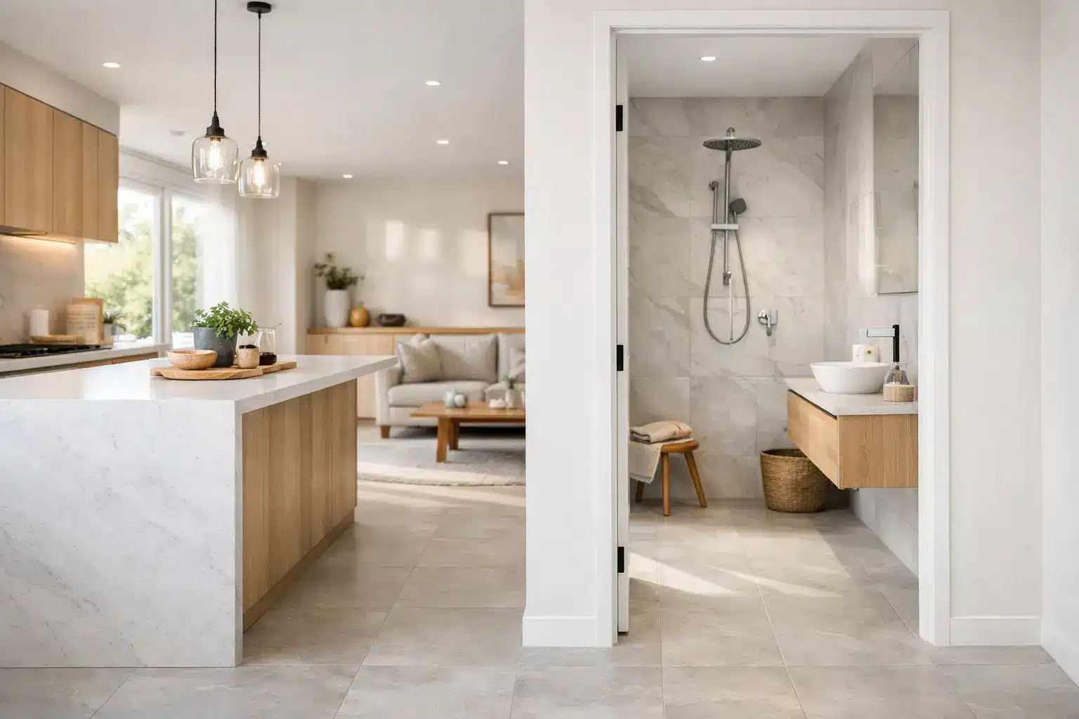
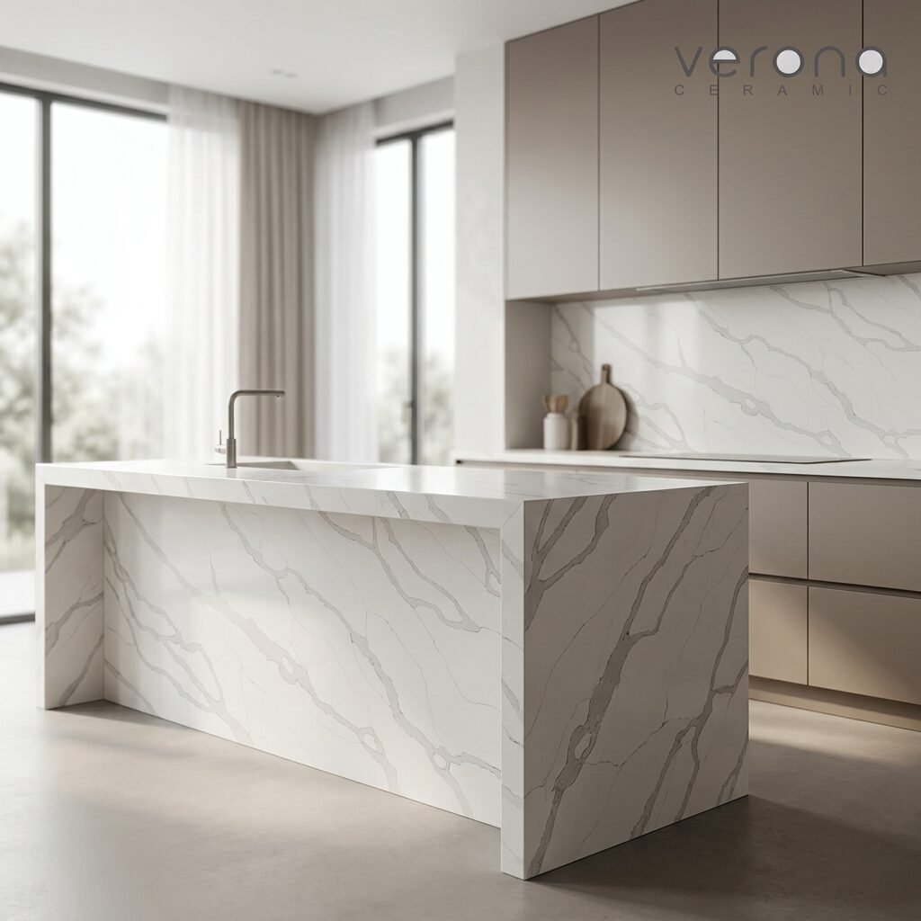
For homeowners who want the benchtop to be a feature, a marble-look surface with pronounced veining can add real character to a white kitchen. This approach suits premium renovations, especially where the benchtop continues up the splashback or wraps a large island.
The reason it works so well is that the white cabinetry stays quiet while the surface introduces movement and personality. It can make a simple kitchen feel custom designed. Porcelain marble-look slabs are especially appealing here because they deliver that elegant visual effect with strong durability and easier day-to-day maintenance than many natural stones.
The main thing to watch is scale. In a compact kitchen, oversized dramatic veining can look busy. In a larger space, it often feels balanced and luxurious.
7. Soft concrete and stone-look neutrals
Concrete-look benchtops in pale mushroom, stone grey or warm cement tones are a smart choice for contemporary homes that want texture without heavy pattern. They pair naturally with white cabinetry and large format tiles, and they suit both minimalist and industrial-leaning interiors.
What many people like about this palette is that it feels grounded. It brings in texture and subtle variation without demanding attention. That makes it particularly useful in kitchens where the flooring, joinery or splashback already has enough visual interest.
A stone-look neutral also tends to be forgiving over time, which is valuable in busy kitchens where beauty and practicality need to sit side by side.
Finish matters as much as colour
When comparing the best benchtop colours for white kitchens, finish often changes the result more than expected. A polished surface reflects more light and can make a pale benchtop feel brighter and more formal. A matte or satin finish usually feels softer, hides marks better and suits the relaxed luxury many Australian homeowners prefer.
Texture can also influence how natural the colour appears. A lightly textured stone-look porcelain surface often adds depth that flat colours alone cannot achieve. That is especially helpful in all-white kitchens, where subtle material variation prevents the design from feeling sterile.
How to narrow down your choice
Start with the fixed finishes you cannot easily change – floor tiles, splashback, wall paint and cabinet white. Then think about how you want the kitchen to feel. Bright and airy? Warm and inviting? Crisp and modern? Elegant and high contrast?
Samples should always be viewed in your own lighting, not just under showroom lights. Morning sun, afternoon shade and overhead LEDs can all shift the way a benchtop colour reads. If possible, place samples beside your cabinet door and floor tile together rather than judging each element in isolation.
It also helps to be honest about maintenance expectations. Families who cook often may prefer mid-toned or softly patterned surfaces that are more forgiving day to day. Households chasing a hero look may be happy to prioritise visual impact, even if the surface shows a little more.
For renovators wanting both design confidence and practical performance, choosing from ready stock premium architectural surfaces can keep a project moving without compromising on quality. Suppliers that offer local measuring, 3D design support and Australian standards compliance can make the selection process much smoother, particularly for full kitchen renovations.
A white kitchen gives you freedom, but the benchtop is what gives it direction. Choose the colour that makes the room feel settled, useful and beautiful when the school bags are on the floor, dinner is half-prepared and the kitchen is being lived in properly.