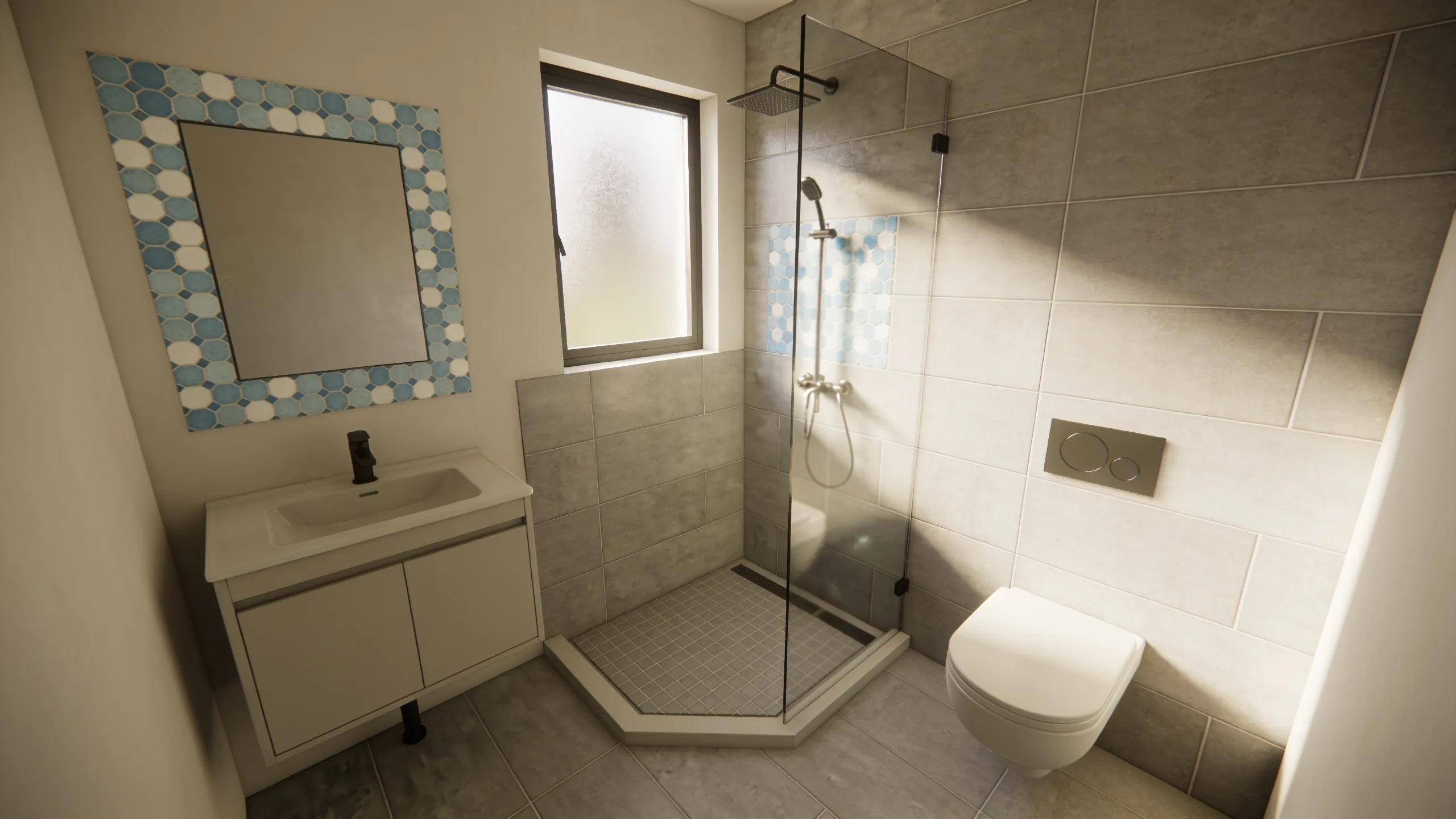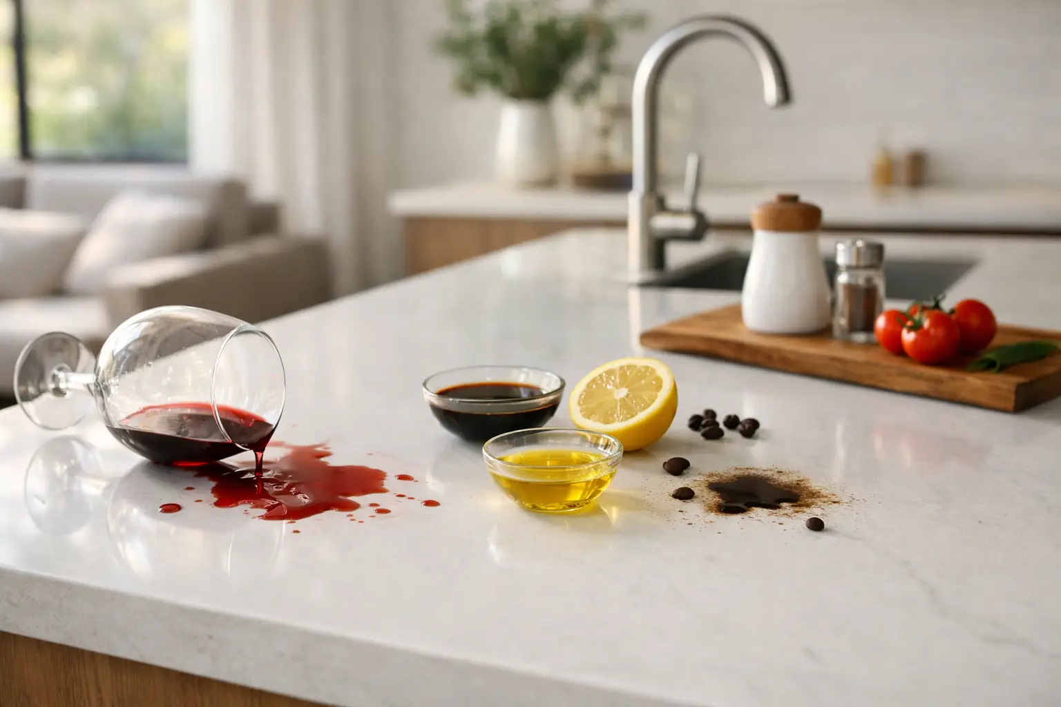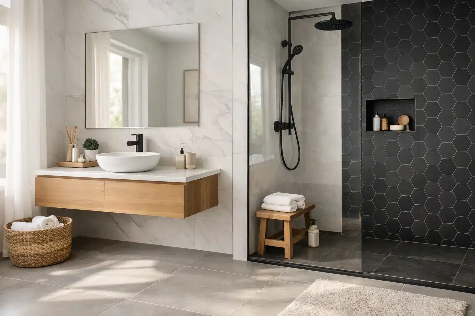
A well-chosen tile has to do more than look good under showroom lighting. It needs to handle muddy shoes, busy mornings, splashes around the vanity and years of daily cleaning without losing its appeal. The tile trends Melbourne homes are embracing in 2026 reflect that practical reality: warmer colours, calmer surfaces and durable porcelain formats that make everyday spaces feel considered rather than precious.
For homeowners, designers and builders, the strongest direction is not about chasing a short-lived look. It is about selecting premium architectural surfaces that bring texture, proportion and lasting value to kitchens, bathrooms, living spaces and outdoor areas.
Tile trends Melbourne homes are choosing now
Warm neutrals replace cool grey
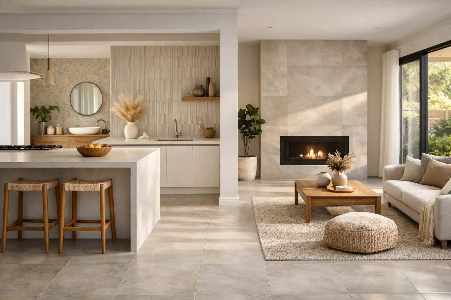
Cool grey has had a long run, but the new neutral palette is softer and more grounded. Think limestone beige, oatmeal, clay, sand, mushroom and gentle taupe. These colours work particularly well with the timber cabinetry, brushed metal tapware and warm-white paint tones increasingly seen in Melbourne renovations.
The appeal is not simply aesthetic. Warm neutral porcelain creates a forgiving backdrop for family life. It is less likely to feel stark on overcast days and gives homeowners greater freedom when changing furniture, artwork or soft furnishings later. A light-to-mid tone can also be more practical than an extremely pale tile in high-traffic entryways and open-plan living areas.
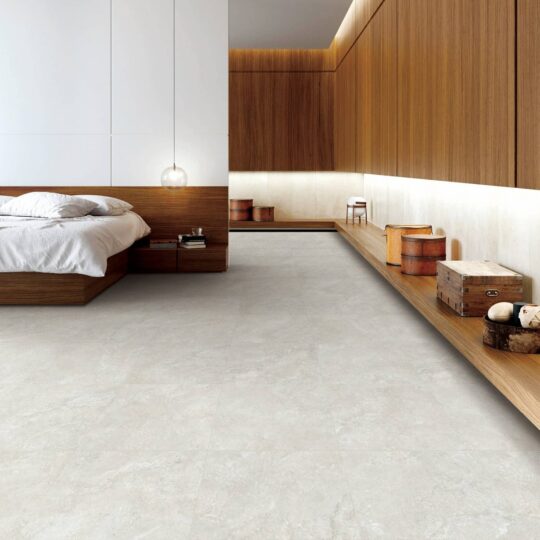
Stone-look porcelain remains a smart choice for achieving this look. Modern printing and glazing create convincing variation, while porcelain offers low water absorption, easy maintenance and dependable durability. Unlike many natural stone finishes, it does not generally need ongoing sealing, making it an excellent option for homes where beauty needs to fit around real routines.
Large-format tiles create calmer rooms
Large-format tiles continue to shape contemporary bathroom and living-area design. Formats such as 600 x 1200 mm and 750 x 1500 mm reduce the number of grout lines across a surface, helping rooms feel more expansive and visually settled. In a compact ensuite, fewer joints can make a noticeable difference to the sense of space.
Large-format tiles are especially effective when wall and floor selections are coordinated in the same colour family. A pale stone-look floor paired with a matching or complementary wall tile can create a refined, hotel-inspired result without making the room feel cold.
There is a practical consideration, however. Bigger tiles require a well-prepared, level substrate and an experienced tiler who understands appropriate adhesive coverage and movement joints. They can also create more cutting waste in rooms with many corners, niches or floor wastes. For some renovations, a 600 x 600 mm tile may provide a better balance of visual impact, installation efficiency and value.
Matte finishes lead in everyday spaces
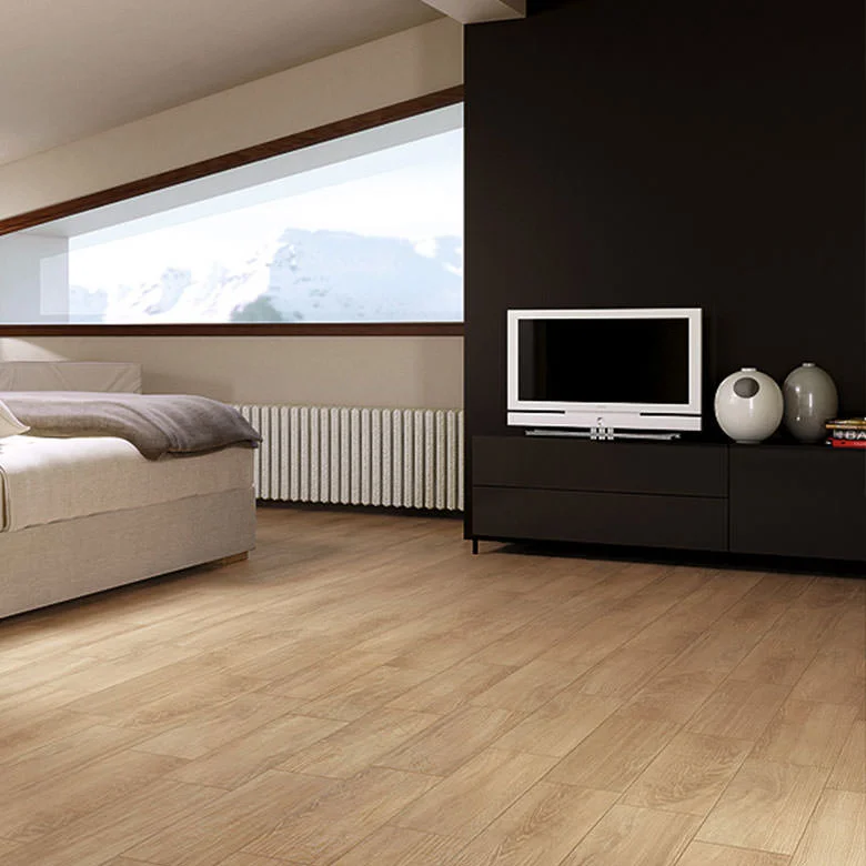
Matte tiles are a clear favourite for floors, bathrooms and relaxed living zones. Their low-sheen surface feels natural, pairs beautifully with timber and stone-look finishes, and generally hides water marks and minor smudges better than highly polished surfaces.
A matte finish should not be confused with a rough or difficult-to-clean tile. Quality glazed porcelain can have a soft, refined feel while remaining straightforward to maintain. The right choice depends on the room. A smooth matte porcelain is often ideal for internal floors, while a more textured finish may suit wet areas and external spaces where additional grip is needed.
For floor safety, check the slip-resistance classification rather than selecting by appearance alone. In Australia, a tile’s P rating is commonly used to assess wet pendulum slip resistance. A higher rating can offer more grip, but increased texture may also require more attention when cleaning. The best result is one that meets the needs of the area without creating unnecessary maintenance.
Feature tiles become more tactile
Feature walls are moving away from busy patterns and towards texture, shape and tonal variation. Fluted profiles, finger tiles, handcrafted-look rectangles and softly undulating surfaces are being used behind vanities, in shower niches and on kitchen splashbacks.
The most successful feature tile designs usually keep the palette restrained. A glossy ivory finger tile, a sage green kit kat profile or a textured sand-coloured rectangle can add depth without competing with every other finish in the room. This approach gives a bathroom personality while allowing the main floor tile and cabinetry to remain timeless.
Smaller-format feature tiles do bring more grout lines, so grout colour matters. A close tonal grout produces a quieter, more continuous surface. Contrasting grout creates definition but can make a small room feel busier. In shower areas, homeowners should also consider the cleaning commitment and choose a quality grout system suited to wet conditions.
Natural stone looks with porcelain performance
Travertine, limestone and marble influences remain popular, but porcelain is increasingly the material of choice for families who want the look with fewer compromises. Travertine-look porcelain, in particular, brings a gentle sense of movement and warmth to floors, walls and alfresco zones.
The current preference is for subtle veining and believable shade variation rather than dramatic, high-contrast marble patterns. Tiles that look natural without being overly uniform give a room character, especially across larger open-plan areas.
When viewing a stone-look tile, inspect several pieces from different boxes. This helps you understand the variation across the range and plan the layout before installation. A good tiler can blend tiles from multiple cartons to avoid concentrated patches of darker or lighter pieces.
For walls, a marble-look tile can still make a striking statement in a powder room or shower. It works best when balanced with simple joinery and a calm floor. The result feels premium without relying on trend-heavy decoration.
Indoor-outdoor continuity remains a strong choice
Melbourne homes often make the most of courtyards, decks and covered entertaining areas, so it is no surprise that indoor-outdoor continuity remains a key design direction. Using related tiles inside and outside creates a longer visual line, making an extension or smaller living area feel more connected to the garden.
This does not always mean installing the exact same tile everywhere. Internal areas may benefit from a smoother matte finish, while an external version with a higher slip rating is more appropriate for rain, pool surrounds and exposed pathways. Matching colours and stone patterns can still create continuity while allowing each area to perform properly.
Porcelain pavers are worth considering for outdoor projects because they are hard-wearing, colour-stable and resistant to moisture. As with any outdoor tile, the substrate, drainage, adhesive and installation method are as important as the tile itself. Planning these details early avoids costly changes once landscaping or cabinetry is underway.
How to choose a trend that will last
The safest way to approach tile trends is to treat them as direction, not a rulebook. Choose the large surfaces first: flooring, shower walls and kitchen splashbacks. These should suit the architecture of the home, available natural light and the amount of upkeep you are comfortable with. More expressive choices can then appear in smaller areas such as a niche, laundry wall or powder room.
Technical suitability should sit alongside colour and style. For floors, ask about the tile’s PEI rating where relevant, particularly for glazed porcelain in busy residential areas. Consider slip resistance for wet rooms and outdoors, confirm the required tile quantity with an allowance for cuts and future repairs, and check that all boxes are from the same batch before installation begins.
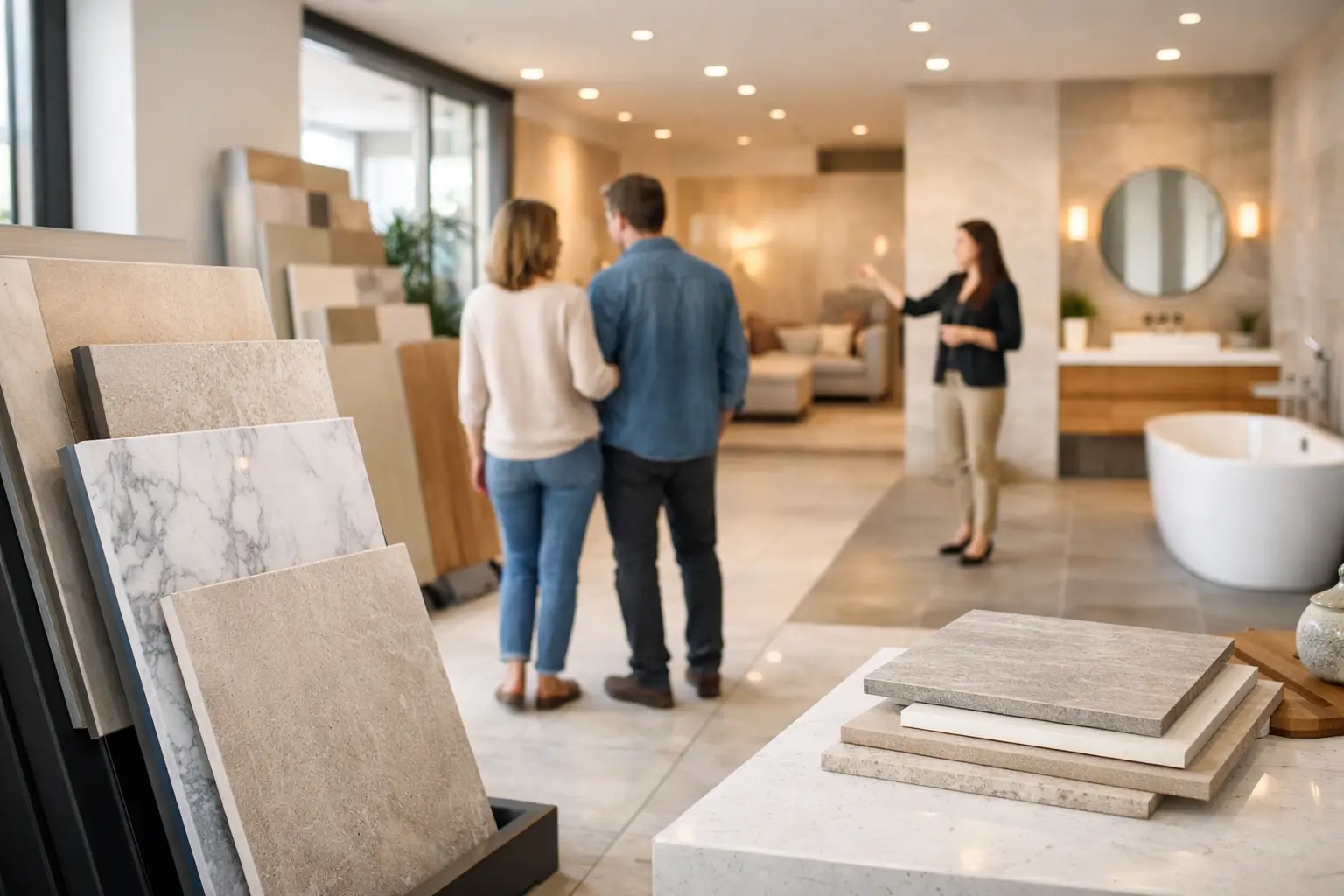
A physical sample is invaluable. Take it home and view it against cabinetry, flooring and paint in morning, afternoon and artificial light. A tile that appears creamy in a showroom may read cooler beside a particular benchtop or wall colour.
For a cohesive renovation, pair warm porcelain flooring with complementary zero-silica benchtops rather than trying to match every surface exactly. Slight contrast between the floor, joinery and benchtop adds depth, while a shared undertone keeps the scheme connected.
Local stock availability matters too. Selecting ready stock from a Melbourne warehouse can help keep a renovation moving when a builder, cabinet maker and tiler all need materials on site at the right time. Verona Ceramic supports this process with factory-direct tiles, practical selection advice, and free measuring and 3D design services to help homeowners visualise the finished space before committing.
The best tile trend is the one that still feels right after the renovation dust has settled: comfortable underfoot, easy to care for and quietly beautiful through every ordinary day at home.