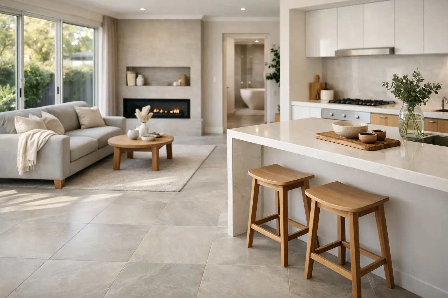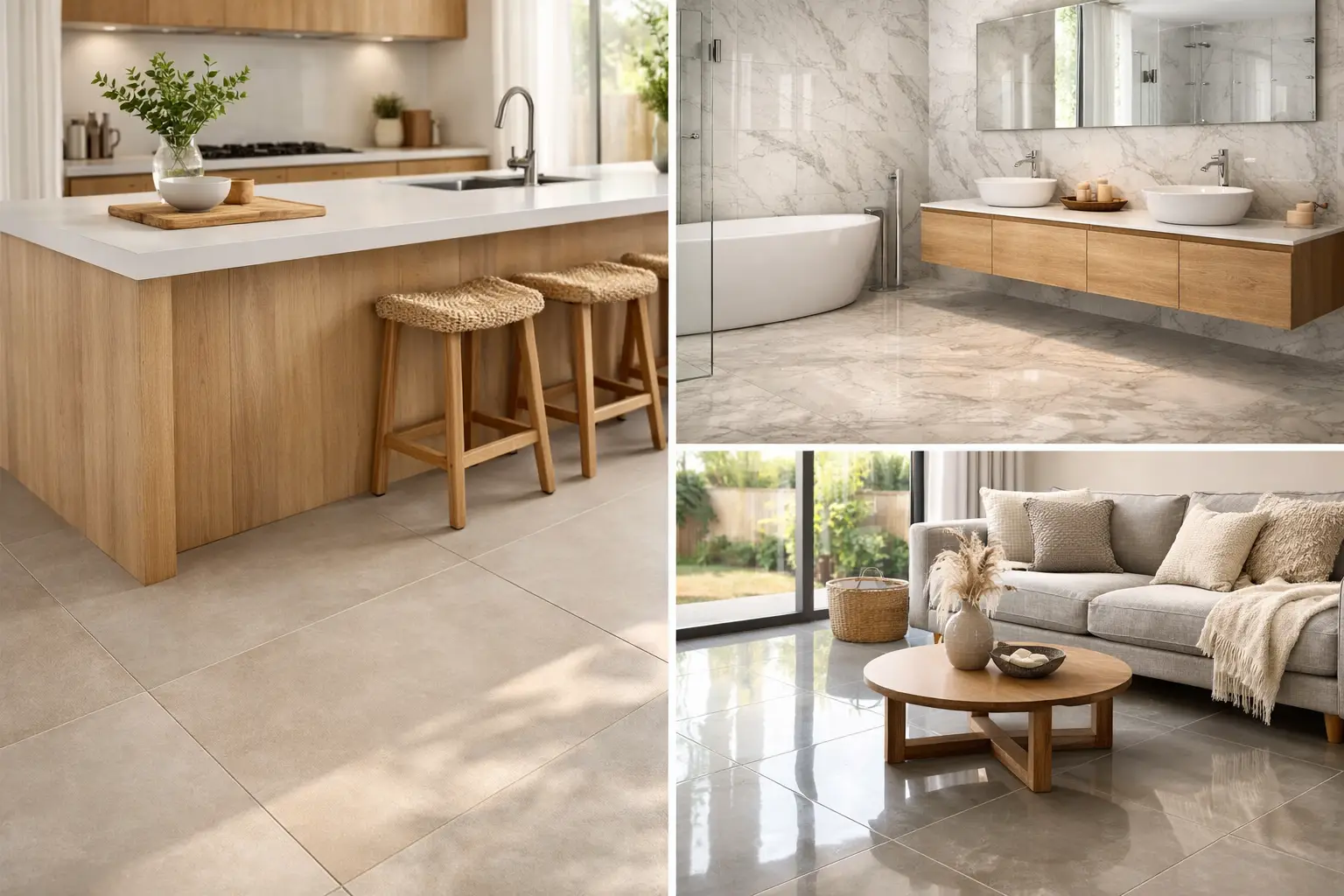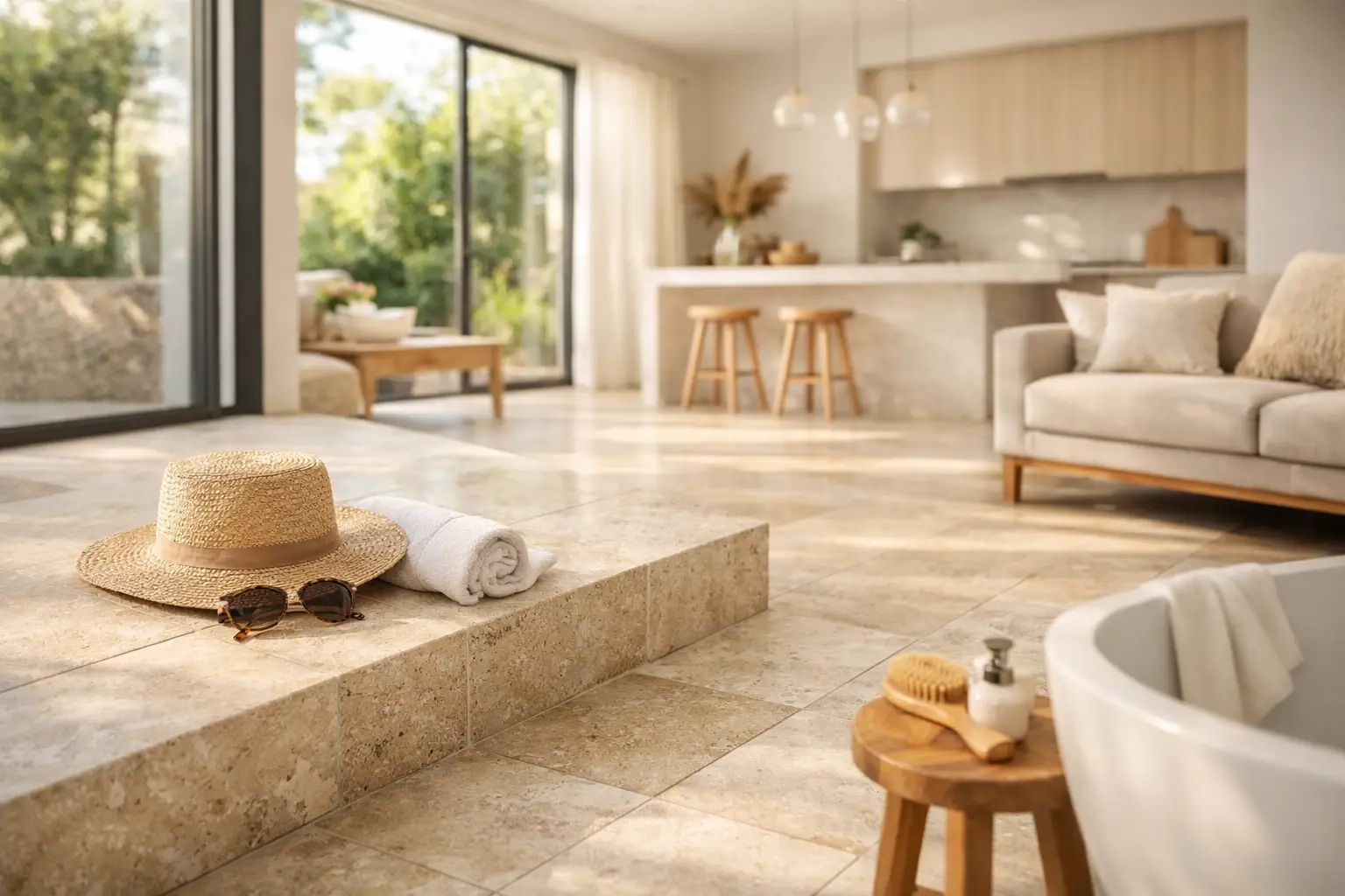
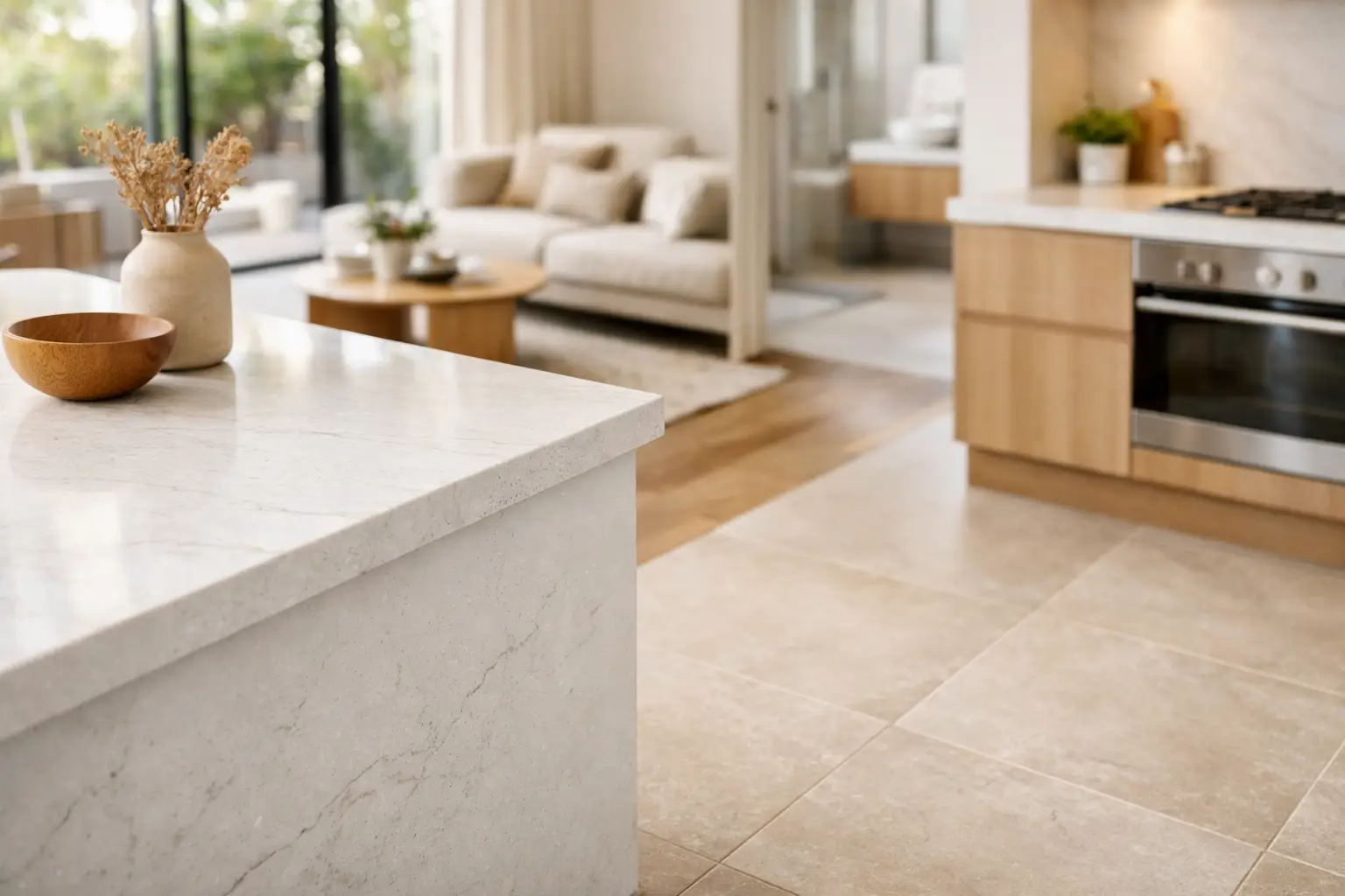
A benchtop and floor tile may sit on different planes, but together they set the visual temperature of the whole room. Knowing how to match benchtops and floor tiles is less about finding two identical colours and more about creating a considered relationship between undertone, texture, scale and daily use. Get that relationship right and the kitchen or living area feels calm, generous and built to last.
For Melbourne renovations, this decision is particularly worthwhile to make early. Flooring usually covers the largest surface area, while the benchtop becomes the closest and most frequently used finish. Choosing both together avoids the common problem of a beautiful sample that feels unexpectedly yellow, cold or busy once installed across a full room.
Start with the floor as the foundation
Floor tiles have the greatest visual weight because they extend beneath cabinetry, furniture and natural light. Select the floor finish first in most projects, then narrow down benchtops that complement it. This is especially helpful with large format tiles, where the colour and veining can have a strong effect on how spacious the room feels.
A warm beige or greige porcelain floor generally works best with benchtops carrying warm whites, soft creams, mushroom tones or gentle taupe veining. Cool grey tiles are more at home with crisp white, pale grey or charcoal-based surfaces. The aim is not a perfect colour match. In fact, a benchtop that is too close to the floor can make the cabinetry appear to float between two flat, similar surfaces.
Look at the base tone rather than the most obvious colour. A tile may appear grey at first glance but contain brown, blue, pink or green undertones. Hold the benchtop sample directly beside it in daylight, then repeat the check under the room’s planned lighting. This small step prevents a mismatch that often only becomes clear after installation.
Match the undertone before the pattern
Undertone is the quiet colour running beneath a surface’s main shade. It is one of the most reliable ways to bring porcelain tiles and zero silica benchtops together.
For example, a white engineered stone benchtop with warm beige veining can sit beautifully with travertine-look porcelain tiles, even if one is visibly lighter than the other. Conversely, a cool white benchtop with blue-grey veining can look disconnected next to a creamy floor. Both materials may be called white, but their undertones are telling different stories.
If the floor tile has movement, such as stone-look variation or marble-look veins, choose a benchtop that picks up one secondary colour from the tile. A pale sand vein, soft charcoal marking or warm grey shadow can be enough to establish a connection. If the floor is plain and even, the benchtop can carry more character without making the room feel overdesigned.
Use contrast with a clear purpose
Contrast gives a renovation depth. A light oak-look or warm stone-look tile paired with a deep charcoal benchtop can feel refined and practical, especially with light cabinetry. A pale floor and pale benchtop can also be successful, but they need separation through cabinetry, splashback or texture.
The safest approach is to vary at least two elements. If the floor and benchtop are both light, make one matte and one subtly polished, or choose cabinetry in a mid-tone timber or coloured finish. If both surfaces are dark, allow sufficient natural and artificial light, and consider a lighter splashback to keep the room open.
Consider finish and texture, not colour alone
A room made entirely from glossy surfaces can feel harsh under downlights and show footprints more readily. A room made only from heavily textured finishes can feel visually dense and be harder to maintain. Combining finishes is often the answer.
Matte tiles are a popular choice for family homes because they provide a softer appearance and can be forgiving between cleans. They pair well with a honed or matte-look zero-silica engineered stone benchtop for a calm, architectural result. If you prefer a polished benchtop, a matte porcelain floor can balance the shine while keeping the overall scheme practical.
Texture also affects safety. For internal living areas, select a porcelain tile suited to the expected level of traffic and cleaning. In wet areas or entries, slip resistance matters as much as appearance. An R rating indicates a tile’s slip resistance in tested conditions, but the appropriate rating depends on the location, expected moisture and cleaning regime. A tile professional can help you select a finish that feels cohesive with adjoining spaces without compromising everyday safety.
Keep the scale of veining in balance
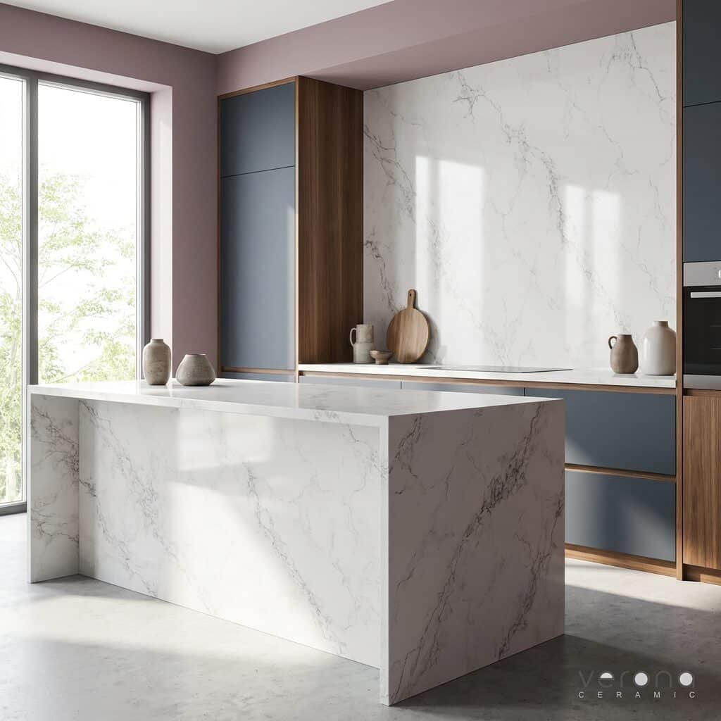
Large format floor tiles with dramatic marble-look veining can be striking, but they need a quieter partner. Pair them with a benchtop that has a soft background and restrained movement. Repeating bold veins across both the floor and benchtop can make the room feel busy, particularly in a kitchen with overhead cabinetry and a splashback also competing for attention.
The reverse is equally useful. If you have chosen simple concrete-look or neutral porcelain tiles, a benchtop with elegant veining can become the feature surface. This is a practical way to add premium architectural character without covering every plane in pattern.
Tile size matters too. Large format tiles reduce grout lines and create a more continuous floor, which can make a kitchen or open-plan living area feel larger. Their clean scale often suits a benchtop with a broad, uncluttered pattern. Smaller tiles or more visible grout introduce more visual detail, so a calmer benchtop usually brings better balance.
Bring cabinetry, grout and splashback into the decision
Benchtops and floor tiles never work in isolation. Cabinetry is the bridge between them, while grout and splashback choices can either strengthen or disrupt the palette.
For a low-contrast, timeless scheme, choose grout close to the tile’s dominant tone. This gives the floor a more expansive appearance and lets the benchtop remain the visual focus. A contrasting grout can suit a deliberately graphic look, but it adds another strong line to coordinate and is generally better reserved for simpler tile formats.
Cabinetry can resolve a pairing that feels too close or too far apart. Warm white cabinets help connect beige porcelain flooring with a creamy benchtop. Natural timber cabinetry can soften cooler grey tiles and add warmth to crisp white stone. Dark cabinetry works well as a transition between a light floor and dark benchtop, but sample it carefully, as the combined scheme may absorb more light than expected.
For splashbacks, decide which surface should lead. If the benchtop has expressive veining, a quiet porcelain splashback or a simple tonal tile is often enough. If the floor and benchtop are restrained, the splashback can introduce a little more texture or colour. Keeping one major surface visually calm is usually what makes the final room feel polished rather than crowded.
Test full-size samples in the actual space
Small samples are useful, but they cannot show how a finish behaves across a room. Whenever possible, view a full tile and a generous benchtop sample alongside your cabinet colour, paint swatch and splashback option. Place them flat, then stand back several metres. A pairing that looks perfect at arm’s length may appear too similar or too contrasting from across the kitchen.
Check samples in morning light, afternoon light and with the lights you plan to use at night. Melbourne’s changing daylight can reveal undertones that a showroom sample board does not immediately show. Also look at the materials next to stainless steel appliances, black tapware or brass hardware, as metallic finishes can push a scheme cooler or warmer.
At Verona Ceramic, homeowners can bring their selected samples together while considering ready stock tiles, zero-silica benchtop options and the practical dimensions of their space. A free measure and 3D design service can be particularly helpful for confirming how tile direction, cabinetry and benchtop overhangs will read as one complete design.
Choose materials that support daily living
A good match should remain practical long after the renovation photos are taken. Porcelain is valued for its durability, low water absorption and easy-care surface, making it well suited to kitchen tiles, bathroom tiles and busy family living areas. For glazed porcelain floors, the PEI wear rating can help indicate resistance to surface wear, with higher-rated products generally better suited to heavier foot traffic.
Zero-silica engineered stone benchtops provide a considered option for kitchens where beauty, easy cleaning and safer material choices matter. Select the edge profile, finish and colour with daily use in mind. Very dark, high-gloss surfaces can show dust or water marks more readily, while heavily textured finishes may require more attention around spills. There is no single best choice, only the finish that fits your household, lighting and cleaning preferences.
The most successful combinations feel intentional without demanding attention. Choose a floor that grounds the room, a benchtop that complements its undertone, and enough contrast to let each surface do its job. When the samples look balanced in your own light and suit the way your family lives, you are well on the way to a home that feels beautiful every day.