A splashback may cover a relatively small area, but it sits at eye level and catches the light all day. It also needs to handle cooking splatter, steam and regular wiping without becoming a high-maintenance part of the kitchen. Knowing how to select kitchen splashback tiles comes down to balancing the look you love with the practical realities of your household, cabinetry and benchtop.
For most Melbourne renovations, the best choice is not simply the most dramatic tile in the showroom. It is the tile that works confidently with the room’s proportions, performs well behind the cooktop and remains easy to live with years after installation.
Start with the benchtop and cabinetry
A splashback should support the larger, more permanent finishes in your kitchen. Benchtops, cabinetry and flooring usually occupy more visual space or cost more to replace, so choose these first where possible. Then use the splashback to either create continuity or introduce a measured point of contrast.
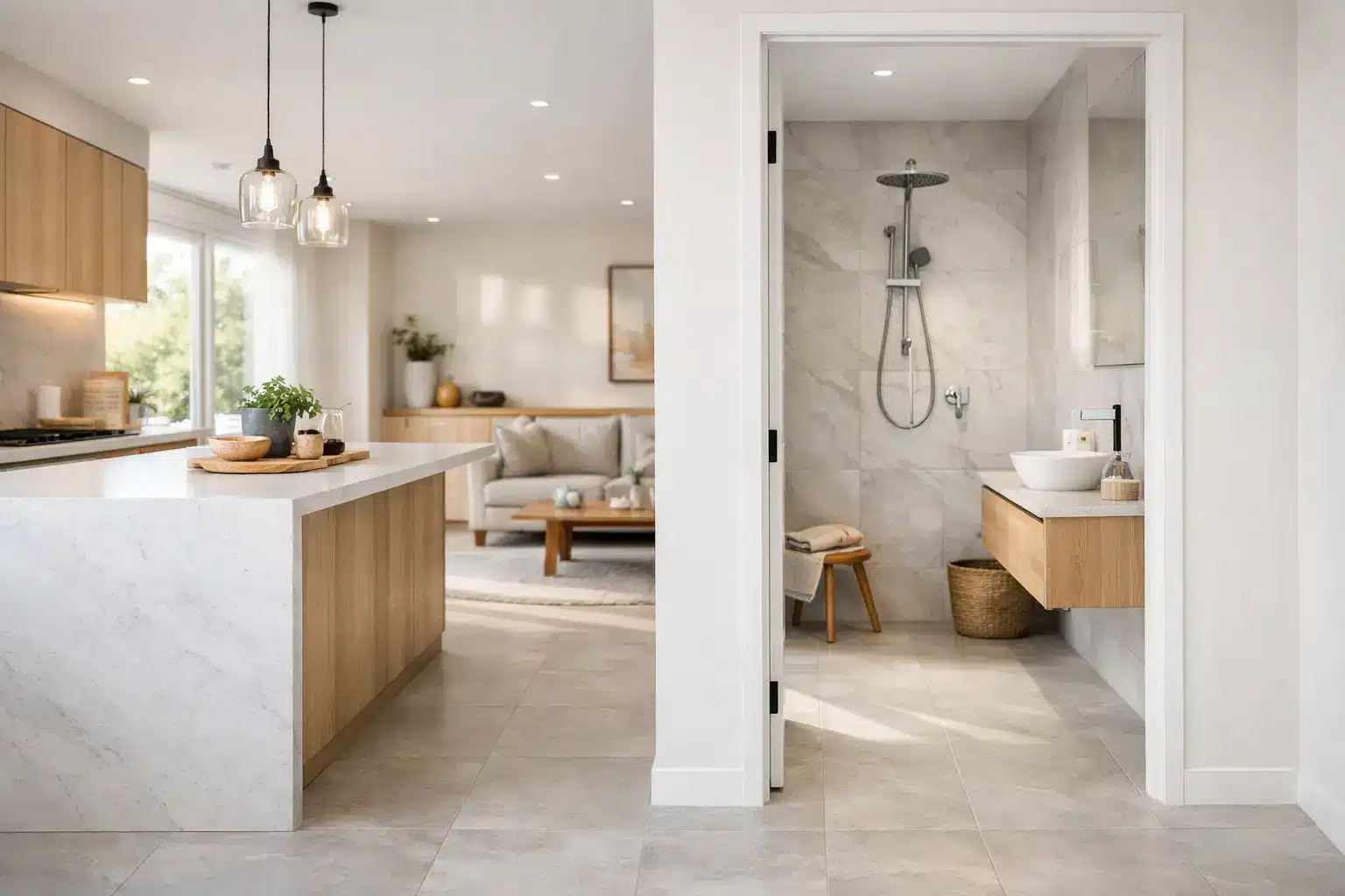
If you have a strongly veined engineered stone benchtop, a quiet tile often gives the kitchen room to breathe. A simple off-white, warm grey or soft matte porcelain can pick up the base tone without competing with the movement of the stone. Zero-silica engineered stone benchtops are a particularly practical foundation for family kitchens, combining a refined appearance with a safety-focused material choice.
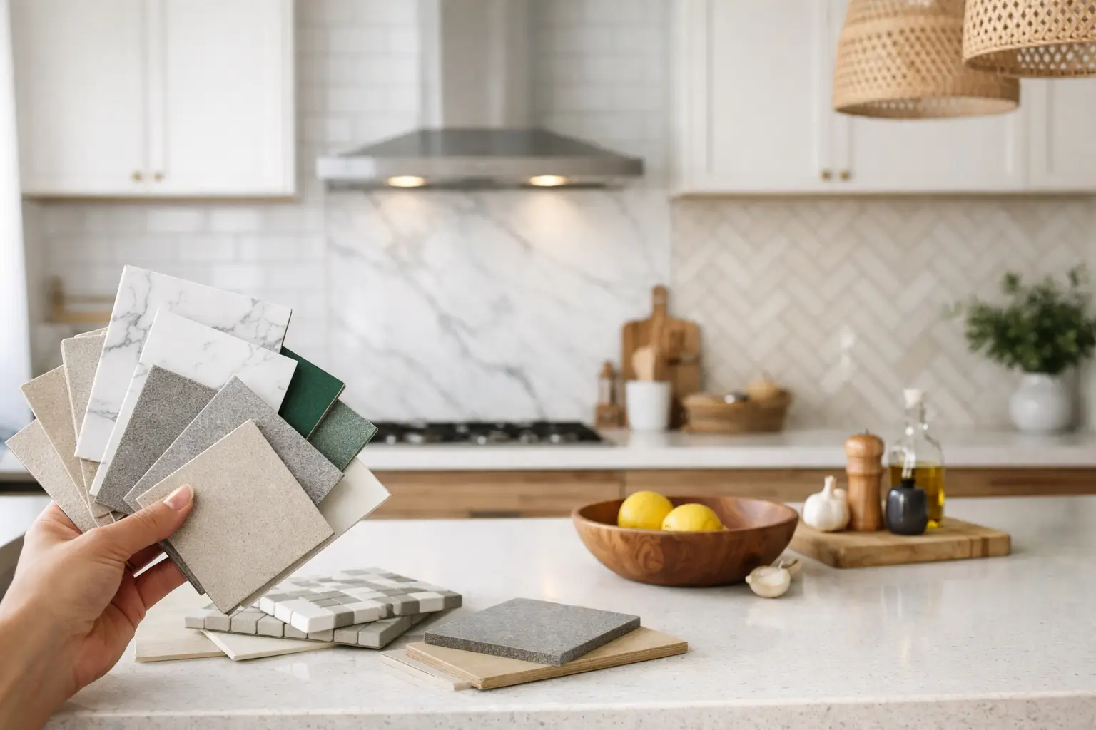
With plain cabinetry and a calm benchtop, the splashback can carry more personality. A handmade-look tile, a gentle gloss, a vertical stack pattern or a deeper colour can add texture without overwhelming the room. Bring cabinet, benchtop and floor samples together before deciding. Colours that look similar under showroom lighting can show very different undertones in natural kitchen light.
Decide whether you want contrast or continuity
Continuity creates a composed, architectural result. Matching or closely coordinating the splashback with the benchtop can make a compact kitchen feel wider and less visually busy. Large-format porcelain panels or tiles are especially effective where a minimal grout-line look is preferred.
Contrast can add depth and character. Dark tiles above pale cabinetry, for example, create a clear horizontal break. This works best when there is another dark element in the kitchen, such as handles, tapware or a window frame, to make the choice feel intentional.
Choose a material that suits daily kitchen use
Ceramic and porcelain are both excellent options for kitchen splashbacks. The right choice depends on the finish, size, budget and look you are aiming for rather than a single rule.
Porcelain tiles are dense, low-porosity and highly durable. They are well suited to busy homes, particularly in larger formats or stone-look designs where you want enduring quality and easy cleaning. Porcelain tiles also give designers and builders a broad range of finishes, from quiet mattes to detailed marble looks.
Ceramic wall tiles often offer richer glaze variation, softer edges and more decorative shapes. They are a sensible choice for a traditional subway tile, a handcrafted aesthetic or a feature colour. Because a splashback is a vertical wall surface, it does not need the same slip-resistance rating required for floors. Still, select a quality wall tile with a finish designed for regular cleaning and kitchen conditions.
Natural stone can be beautiful, but it requires a more considered approach. Some stones are porous and need sealing, while acidic food splashes can mark certain surfaces. If low maintenance is a priority, porcelain that recreates a stone look is often the easier long-term solution.
How to select kitchen splashback tile size and shape
Tile size changes the rhythm of a kitchen. Large-format tiles create fewer grout lines, giving a clean, expansive finish that suits contemporary cabinetry and open-plan homes. They can also make cleaning easier. However, larger tiles may need careful cutting around power points, rangehoods and window reveals, so accurate measuring and an experienced installer matter.
Smaller tiles introduce texture and movement. Subway tiles remain popular because they are versatile, readily understood by installers and available in many finishes. A stacked layout feels crisp and modern, while a brick bond is more relaxed and classic. Square tiles, fingers, kit kats and mosaics can make a feature of the splashback, though more joints mean more grout to maintain.
Before ordering, consider how the tile will finish at the top edge, around the rangehood and at exposed ends. A tile that looks excellent on a sample board can feel awkward if it leaves narrow cut pieces at a highly visible corner. A free measuring and 3D design service can help map out these details before installation, especially when working with large-format tiles or a full-height splashback.
Think about full-height versus standard-height tiling
A standard splashback generally runs from the benchtop to the underside of upper cabinets. It is efficient and practical, and it remains a strong choice for many kitchens.
Running tiles to the ceiling creates more visual impact. This is particularly effective on a rangehood wall, behind open shelving or in kitchens without upper cabinets. It can make ceilings appear higher, but it will use more material and involves extra preparation, trimming and labour. The choice depends on the room’s architecture and budget, not just current trends.
Select the right finish for cleaning and light
Gloss tiles reflect light and can brighten a kitchen with limited natural daylight. Their reflective surface is easy to wipe after cooking, although strong gloss can reveal fingerprints or water spots more readily in some colours. A gloss tile also gives colour extra depth, which can be appealing for green, blue or white splashbacks.
Matte tiles offer a softer, more contemporary look. They are excellent alongside matte cabinetry, timber joinery and honed-look benchtops. A quality matte glaze is still straightforward to clean, but heavily textured tiles can hold grease in their surface detail, particularly close to the cooktop. If you love texture, reserve it for an area away from the main cooking zone or ask for a sample to test with a damp cloth.
A lightly structured or satin finish often provides the middle ground: less reflective than gloss, but smoother to maintain than a deeply textured surface. For households that cook frequently, this can be a very sensible option.
Do not treat grout as an afterthought
Grout has a major effect on both appearance and upkeep. A close colour match creates a calmer, more continuous finish, especially with large-format tiles. Contrasting grout highlights each tile and suits layouts where the pattern is part of the design.
For a white tiled splashback, bright white grout can look fresh but may require more regular care near the cooktop. A soft grey, warm white or grout tone that relates to the tile’s shading can be more forgiving while still looking refined. Choose a quality grout suitable for wall applications and follow the installer’s advice on sealing or care requirements.
Also consider grout-joint width. Rectified porcelain tiles have precisely cut edges and can usually be laid with narrower, more consistent joints. Handmade-look tiles have variation that is part of their charm, but they normally need wider joints to look balanced. Neither is better – they simply create different results.
Check samples in your own kitchen
Never select a splashback solely from a photograph. Take samples home and view them against your cabinet door, benchtop and flooring at several times of day. Melbourne’s changing light can make a cool white appear blue in the morning and creamy under warm evening lighting.
Place the sample vertically, as a splashback will be installed, rather than flat on the benchtop. Stand back several steps to assess the overall colour, then look closely at the surface, edge and glaze variation. If you are choosing a tile with natural variation, ask to see multiple pieces so the final result holds no surprises.
For renovation professionals, confirming batch, shade and quantity early is equally worthwhile. Ordering enough tiles from the same batch, plus an allowance for cuts and future repairs, helps protect the consistency of the finished kitchen.
Plan for stock, lead times and installation
A beautiful tile is only useful if it is available when the project needs it. Confirm stock quantities before finalising the design, particularly for large kitchens, matching laundry areas or staged builds. Ready stock from a Melbourne warehouse can reduce uncertainty and help keep cabinetry, benchtops and tiling schedules moving together.
Inspect all tiles before installation, as variation in shade, pattern and texture should be assessed before they are fixed to the wall. Discuss substrate preparation, waterproofing requirements where applicable, movement joints and heat clearances around the cooktop with your tiler and builder. The product and the installation both contribute to a durable result that meets Australian standards.
At Verona Ceramic, homeowners and trade clients can compare premium architectural surfaces in person, with factory-direct tiles and practical design support available for projects that need a confident finish. The most successful splashback is one you will enjoy wiping down after a busy family dinner just as much as you enjoy seeing it when you walk into the room.